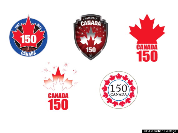
Proposed logos for Canada’s 150th birthday are shown in a handout photo. The logos are getting decidedly mixed reviews from the first Canadians to see them, with some complaining one looks too much like a hockey puck and another is too Disneyland.There were also complaints about a military theme conjured by a badge-like logo, while another retro design was slammed as too boring ??? and it looked like a doily. THE CANADIAN PRESS/HO-Canadian Heritage